New navigation bars use the currently applied SiteStyle, but you can set individual navigation bars to use any available button sets associated with a SiteStyle or create a custom style.
Primary and secondary navigation bars offer different sets of button pictures, which are defined by the current SiteStyle. Other than the pictures displayed, primary and secondary navigation bars function the same way. Because secondary button pictures are typically different in size, shape, or color, you can use a secondary navigation bar to visually distinguish links to different parts of your site. For example, to help site visitors understand the SiteStructure, you can use the secondary navigation bar for the lower levels of your site. To see the difference between primary and secondary navigation bars, go to Style view.
Custom navigation bars are created in Style view and can be used in place of the default primary and secondary navigation bars. Navigation bars available in active site styles can be used on any page, allowing you to create unique styles on individual pages. See Adding Banners and Buttons.
You can also choose whether the button for the current page will be highlighted or not. Use button highlighting to show site visitors which page they are on. If you are using AutoFrames, be aware that highlighting affects the way the browser refreshes your page.
You can also enable rollover buttons on the navigation bar. If rollover is on, when a site visitor moves the pointer over the button, the SiteStyle rollover image appears.
To set the button style:
In Page view, select the navigation bar.
Click the Style tab of the Navigation Bar Properties palette.

In the Button style section:
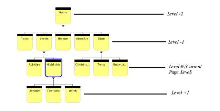
Select the page level, which is relative to the current page, you want to apply the button style to. The style you choose will apply only to the pages at the selected level
 .
.
Choose the SiteStyle from the drop-down list that contains the button style you want to display.
Only active site styles will appear in the list.
Choose the set from the drop-down list that contains the button style you want to display.
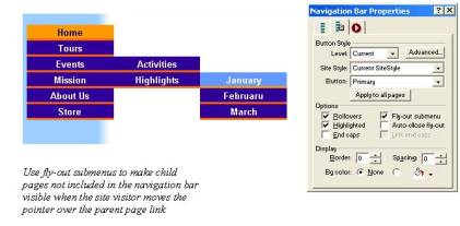
Select the Fly-out submenus check box to make child pages not included in the navigation bar visible when the site visitor moves the pointer over the parent page link.
Click Apply to all pages to apply the selected style to all buttons in the navigation bar.
In the Include section, select:
Rollovers to use the Rollover button state for the selected page in the navigation bar.
Fly-out submenu to make child pages not included in the navigation bar visible when the site visitor moves the pointer over the parent page link.
Highlighted to use the Highlighted button state style for the selected page in the navigation bar.
Auto-close fly-out submenus close the fly-out submenus when the mouse is no longer hovering over.
End caps to display the end caps associated with the selected button set. End caps are graphical elements that appear at both ends of a navigation bar, and they can be added to a button set in Style view. See Adding End Caps to a Button Set.
Link end caps to link the end caps to the adjoining button in the navigation bar. For example, an end cap that is displayed next to the Home page button in the navigation bar will also serve as a link to the Home page
.