You can customize the SiteStyle navigation button sets by adding end caps and section title buttons.
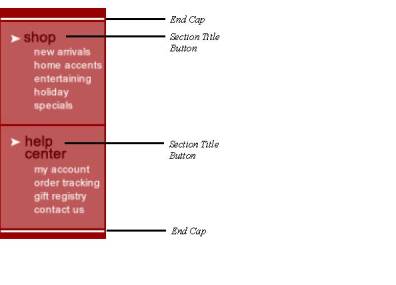
End caps are graphical elements that can be added both before the first button and after the last button of a navigation bar. End caps can be static elements in the navigation bar, or you can choose to link them to their adjoining navigation button. For example, an end cap that appears before the Home page button can function as an extension of the button and serve as a link to the Home page when a user clicks on it.
Section title buttons are static buttons that can be placed between other buttons in the navigation bar, and they are used to divide the navigation bar into sections. You can add text to the section buttons so that they serve as “headings” for groups of pages in the navigation bar.
In Style view, with the Graphic tab selected, select the style you want to add end caps to.
Click on the Primary or Secondary Navigation Bar button set.
The NavBar Sample Properties palette appears.
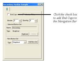
In the NavBar Sample Properties palette, check the End Caps check box.
The end cap buttons for each button state appear below the button set.
Click an end cap button in the NavBar sample to select it.
Click Browse in the Button Properties palette.
The Picture File Open dialog appears.
Navigate to the folder containing the image you want to use for the end cap.
Click Open.
The default end cap will be replaced by the selected image in the NavBar Sample.
Repeat steps 4 through 7 to add end caps for each button state in the navigation bar button set.
End caps created in Style view can be applied to a navigation bar on the Navigation Bar Properties palette in Page view. See Setting Button Navigation Bar Properties
In Style view, with the Graphic tab selected, select the style you want to add section titles to.
Click on the Primary or Secondary Navigation Bar button set.
The NavBar Sample Properties palette appears.
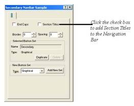
In the NavBar Sample Properties palette, check the Section Titles check box.
Section title buttons for both regular and regular rollover button states appear below the button set.
Modify the appearance of a section title button by selecting it and changing its settings in the Button Properties palette.
Section titles added to a button set in Style view can be applied when creating custom navigation bars.